.jpg&&AlternativeImage=%2fFiles%2fImages%2fmissing_image.jpg)
Tactile Harmonies
From Delicate Pinks to Resilient Mauves. Design is a sensory experience. In this KREYO edit, we delve into a refined Theory of Color built on tonal contrast.
4/15/2026 12:00:00 AM
Kreyo Theory of Color
Tactile Harmonies
From Delicate Pinks to Resilient Mauves
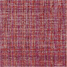
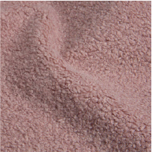
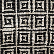
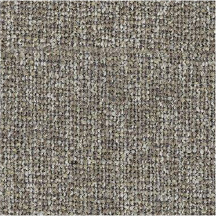
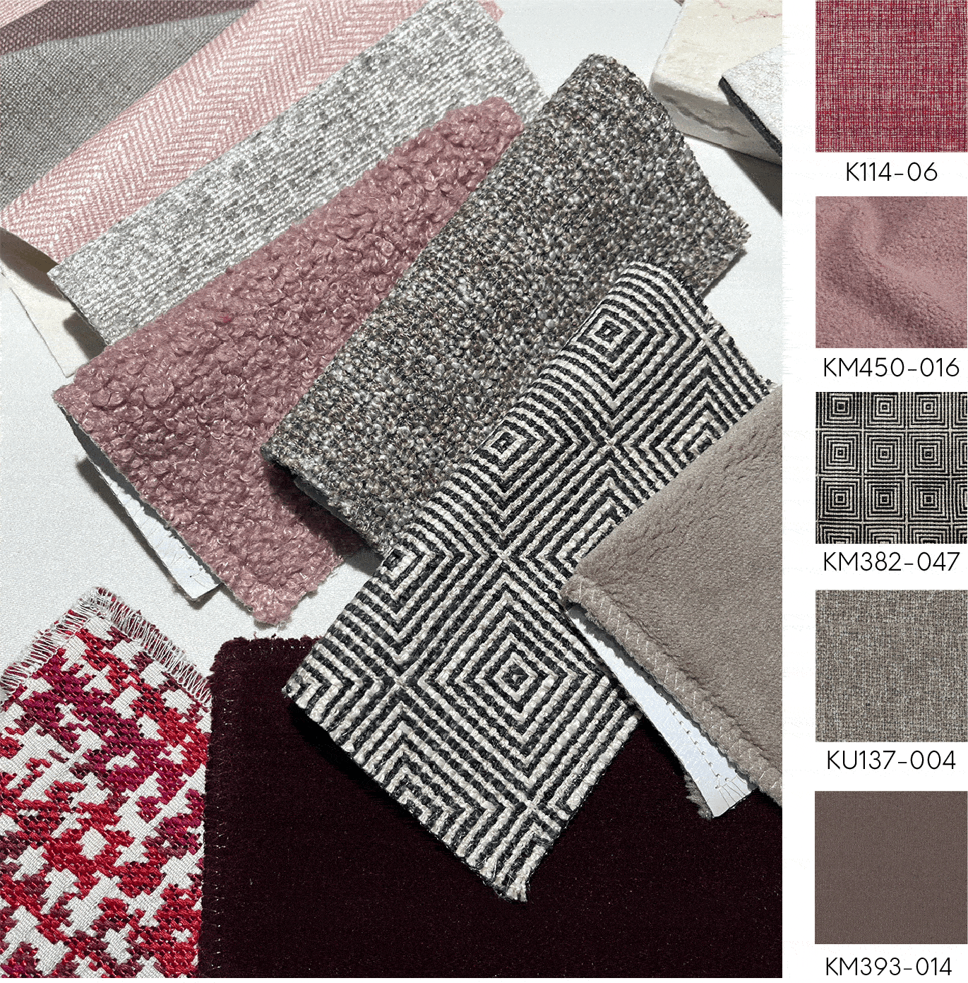
Design is a sensory experience. In this KREYO edit, we delve into a refined Theory of Color built on tonal contrast. It is a harmonious dialogue between delicate, powdery pinks and deep, resilient mauves. By introducing rich velvet textures alongside intricate woven patterns, we create a palette that is both soft to the touch and strong in its character.
We believe every swatch is a building block for a home that feels curated, not just decorated. Bridging the gap between organic warmth and modern city living from the vibrant streets of Jakarta and Singapore to the skylines of Kuala Lumpur and Bangkok, we create spaces where luxury meets a defined, sophisticated structure.
Featured Fabrics